The emotional language of color
Color has an extraordinary ability to transform the way we perceive a space. It can make us feel calm, energize us, or bring back memories we thought we had forgotten. But what is it about certain combinations of colors and materials that makes us feel something? And why do some spaces stay with us long after we've left them?
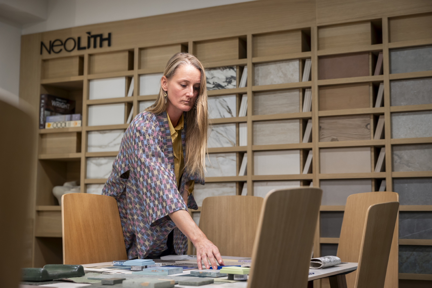
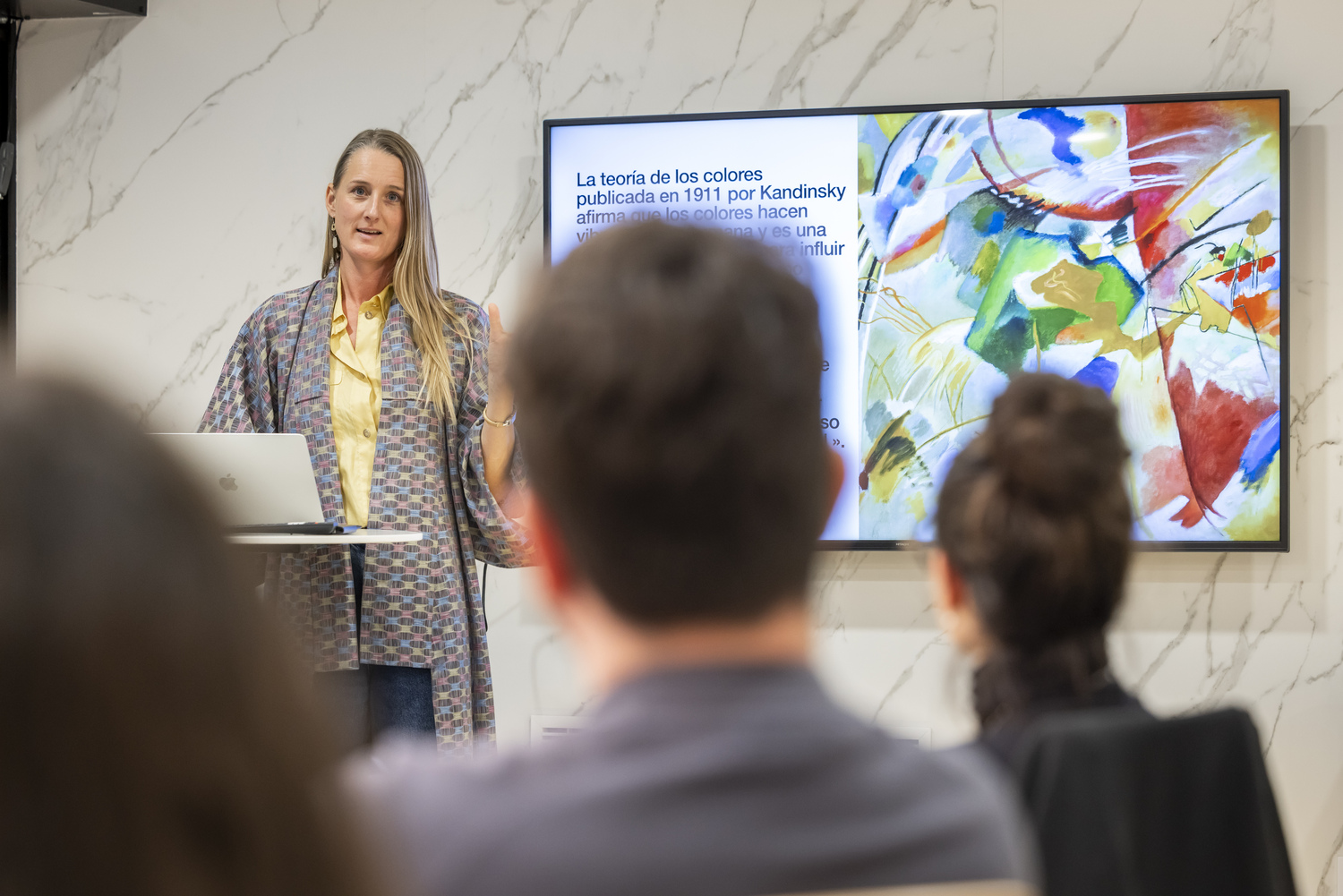
To explore these questions, we spoke with Judith van Vliet, founder of The Color Authority and a global expert in color strategy and CMF (Color, Material, and Finish), a consultancy specializing in color strategy, trends, and color psychology. Her perspective invites us to explore one of architecture's most fascinating qualities: its ability to connect with our emotions.
Color is experienced, felt, and remembered
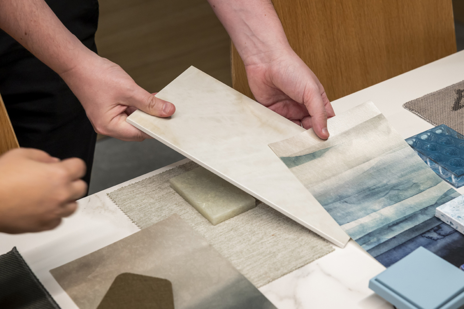
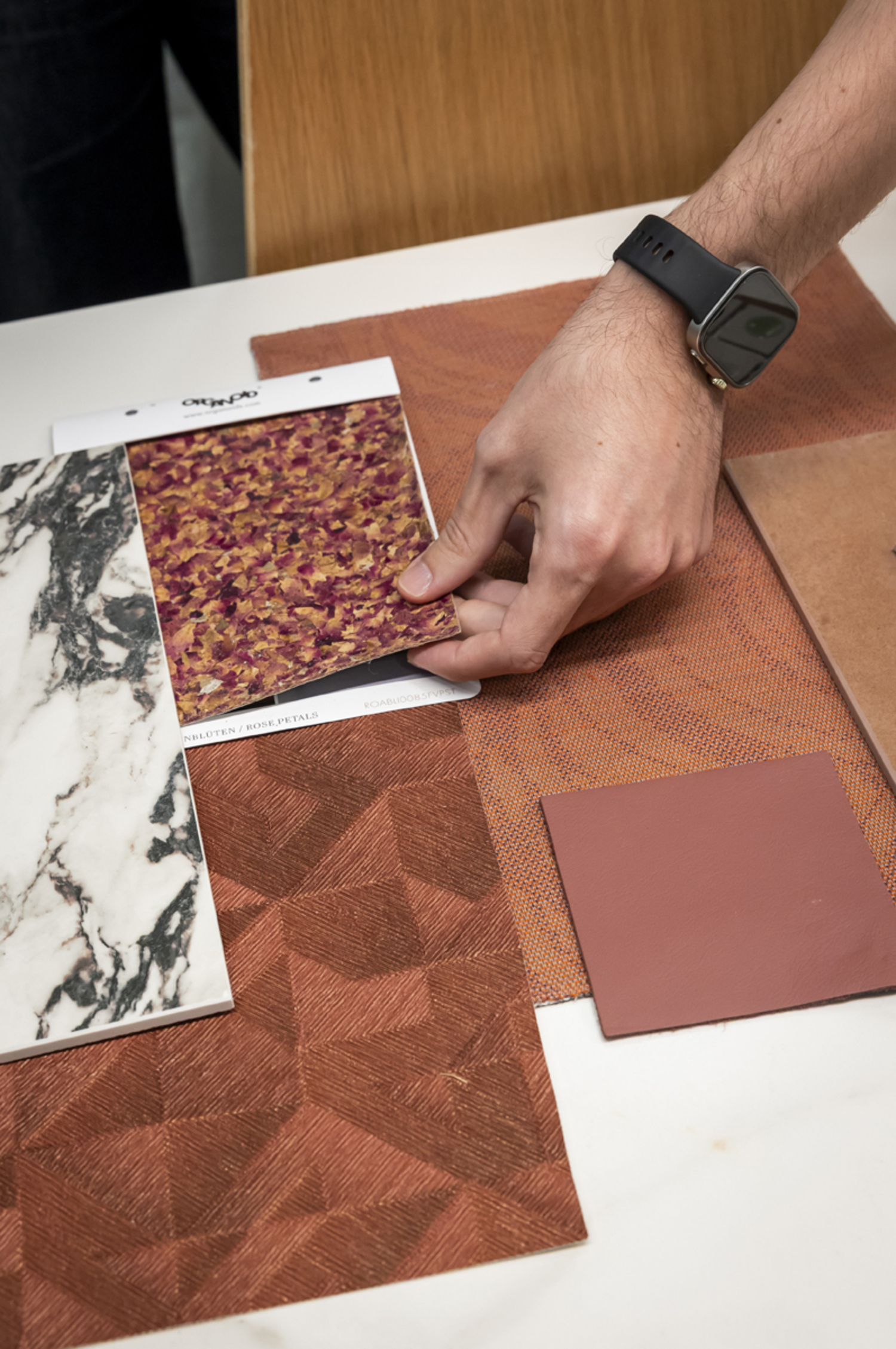
For Judith, choosing a color goes far beyond finding an appealing shade. Its true potential emerges when it interacts with light, textures, and architectural elements, creating atmospheres that shape how we experience a place.
“Color never exists in isolation. It is a deeply contextual experience, constantly changing depending on the light, the surrounding materials, the architecture, and the environment in which it exists.”
— Judith van Vliet, CMF Expert
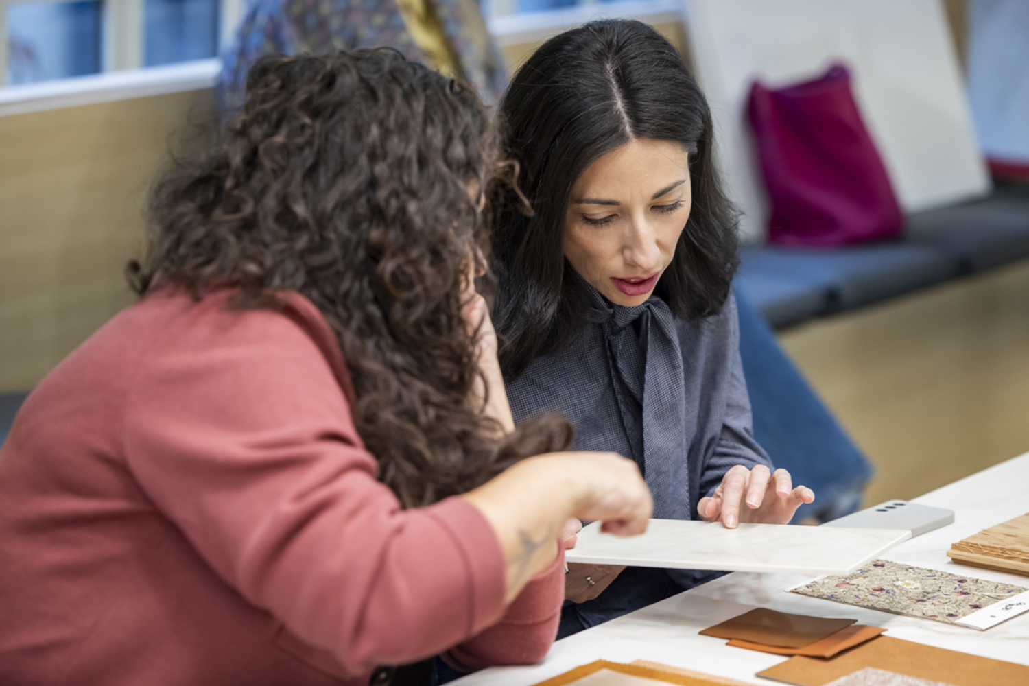
The same shade can feel warm and inviting under Mediterranean sunlight yet take on an entirely different character in a setting with less natural light. Our personal experiences and cultural backgrounds also play a role, influencing the associations we make and the emotions different colors evoke.
 |
 |
This relationship becomes particularly important when we consider well-being. Visual warmth, contrast, and the tactile qualities of materials can help create certain feelings, although there is no universal formula. Every space should respond to the people who use it and their individual needs.
“I like to think of color as a tool for creating atmospheres.”
— Judith van Vliet, CMF Expert
Her perspective reminds us that architecture is also experienced through touch, sound, and temperature. This multisensory dimension encourages us to design spaces that connect with the people who experience them.
Five materials, five ways to express emotions
This sensitivity to color and materiality also inspired Judith's collaboration with Neolith on THE EDIT. A new material language, our latest launch, which invites us to discover surfaces from a more emotional and expressive perspective.
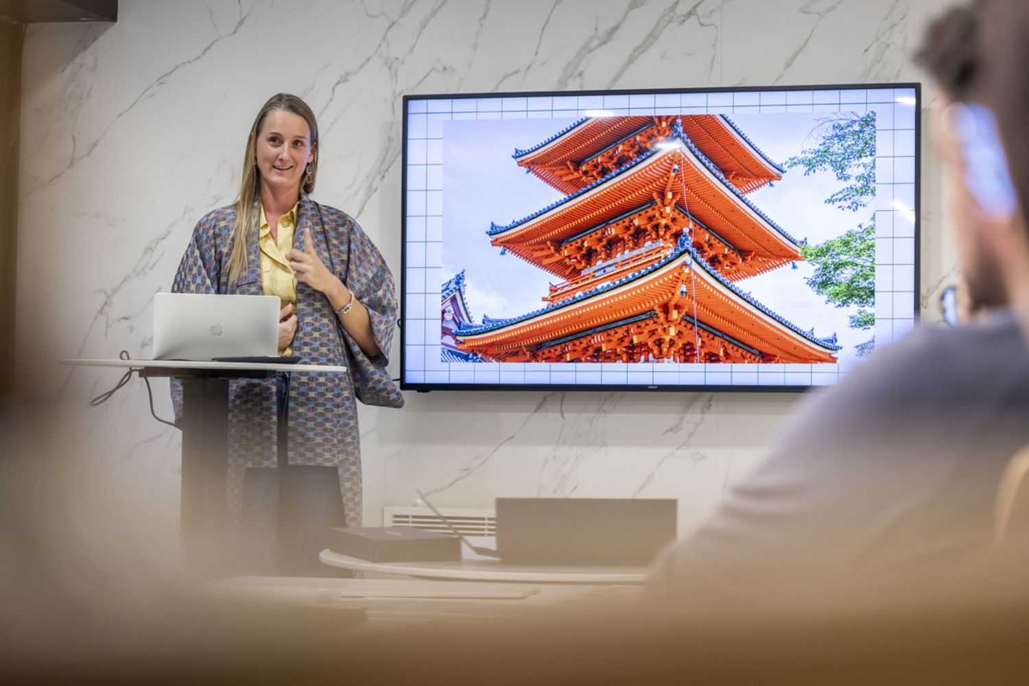
The creative process began by looking closely at each material, exploring its origins, nuances, and textures, and considering the feelings it could evoke. This exploration brought together geological, cultural, architectural, and natural references with insights from fashion and CMF design.
“My role was to find a new way of looking at and telling the stories behind Neolith's new surfaces.”
— Judith van Vliet, CMF Expert
This research led to five codes of expression, each connecting the distinctive characteristics of a surface with an emotion:
 |
 |
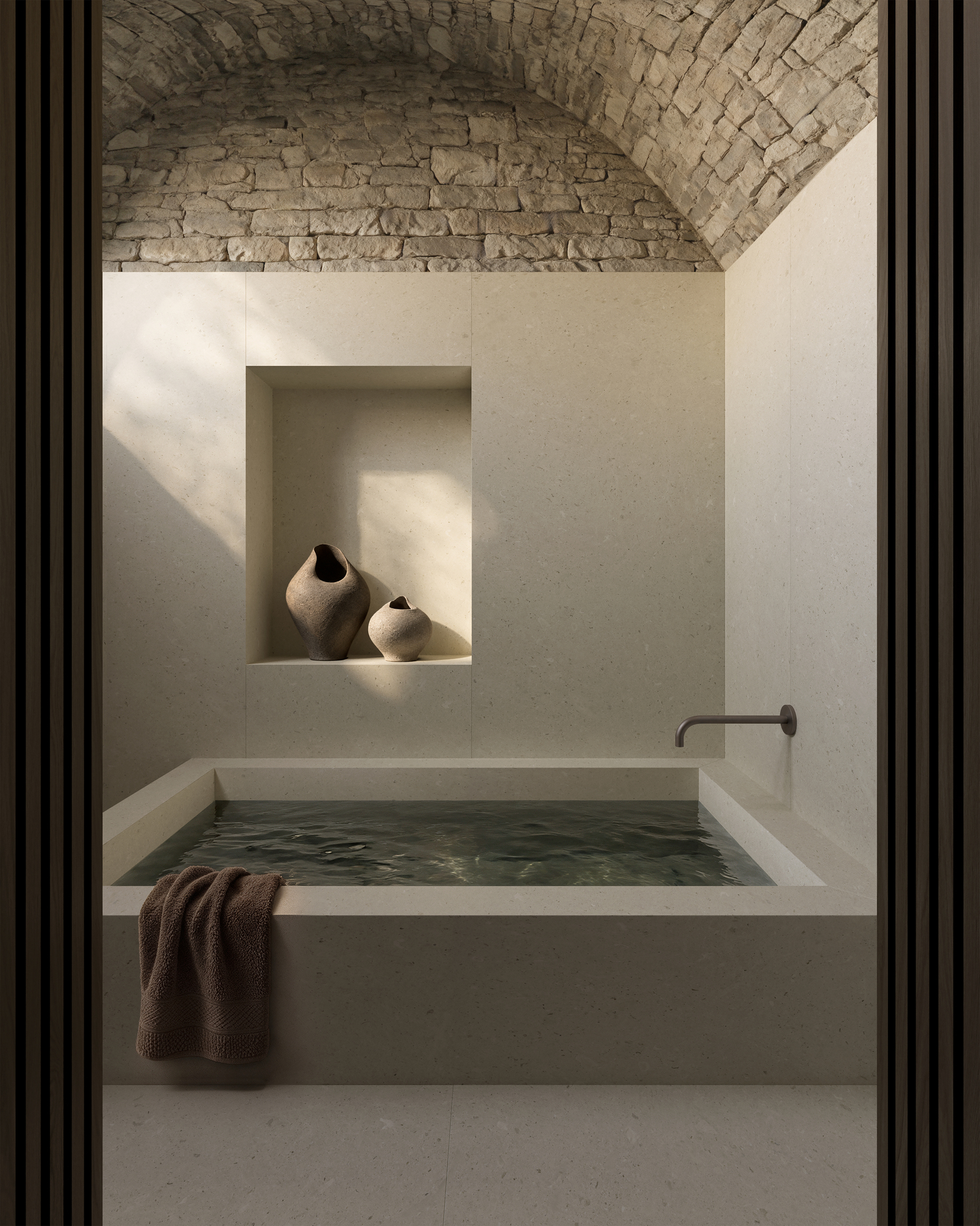
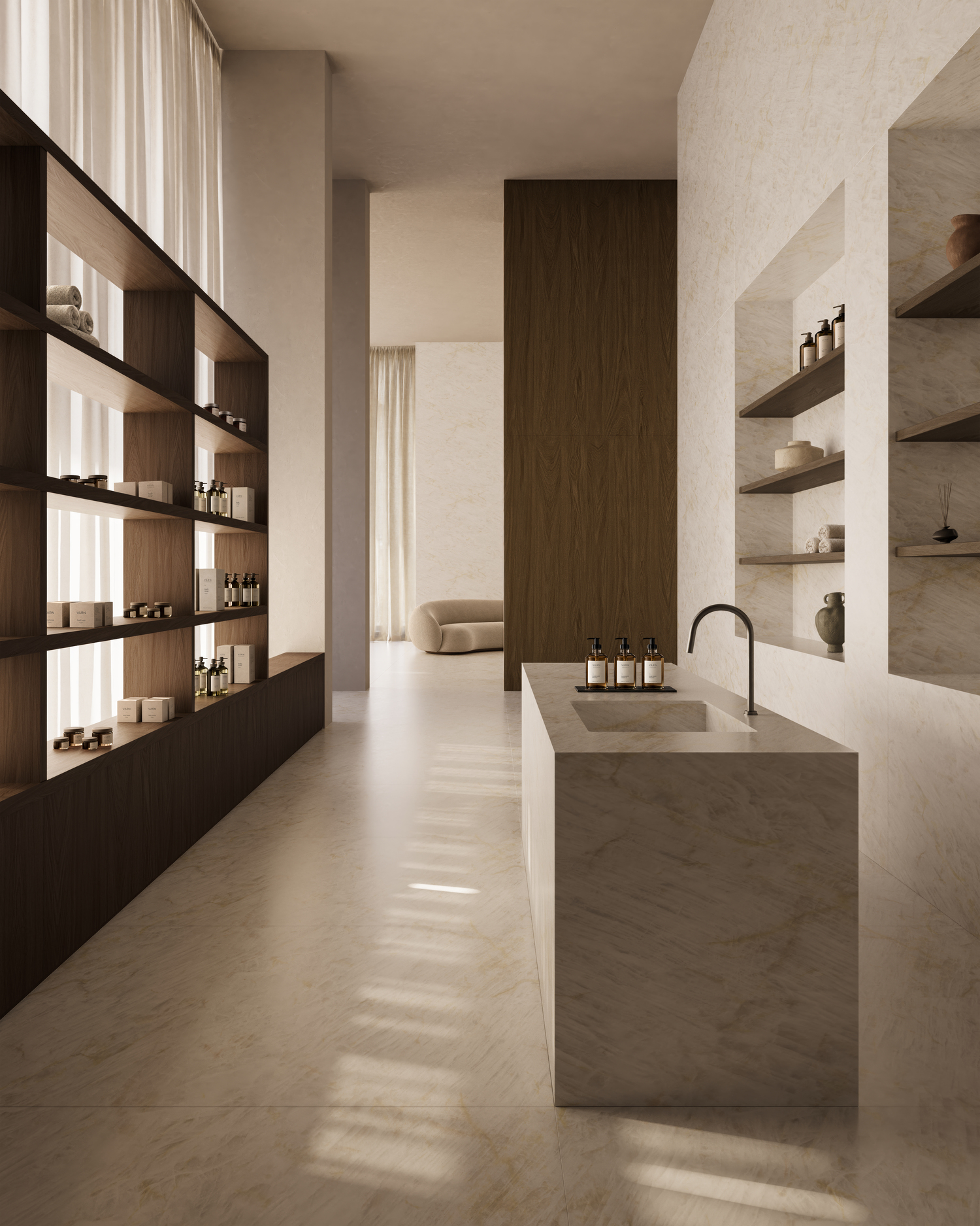
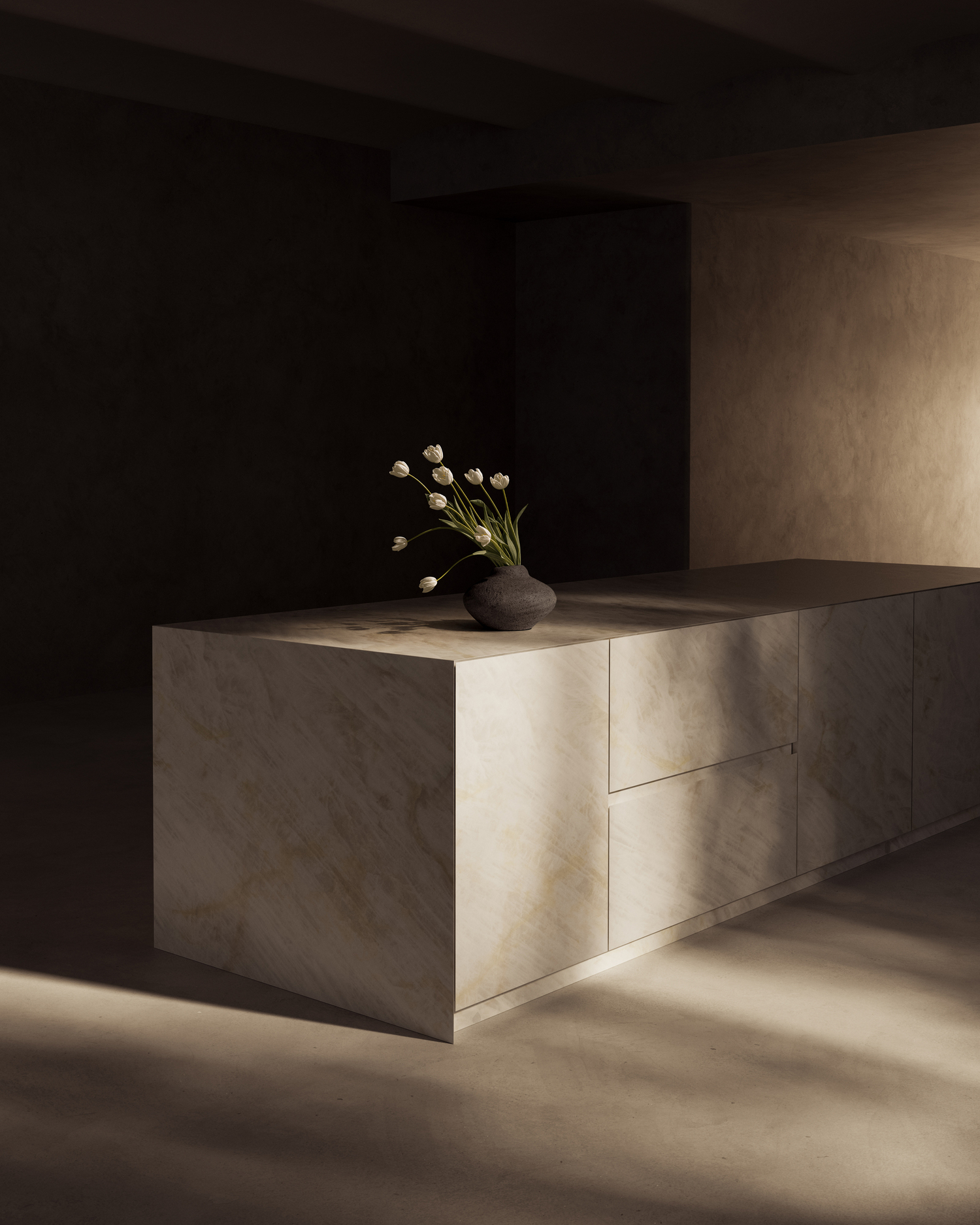
Serenity, expressed through Pale Fossil: the calming qualities of limestone, marine fossils, and subtle mineral tones.
 |
 |
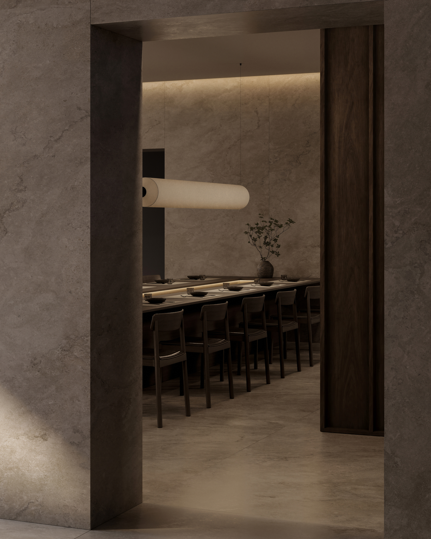
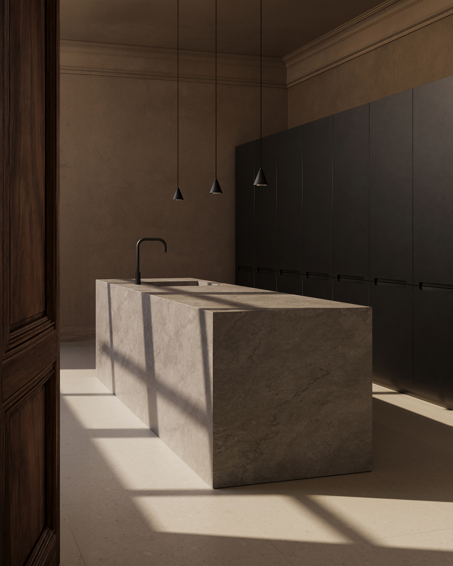
Openness, expressed through Glazed Opaline: the luminosity and reflections of a crystallized surface that evokes lightness and a sense of openness.
 |
 |
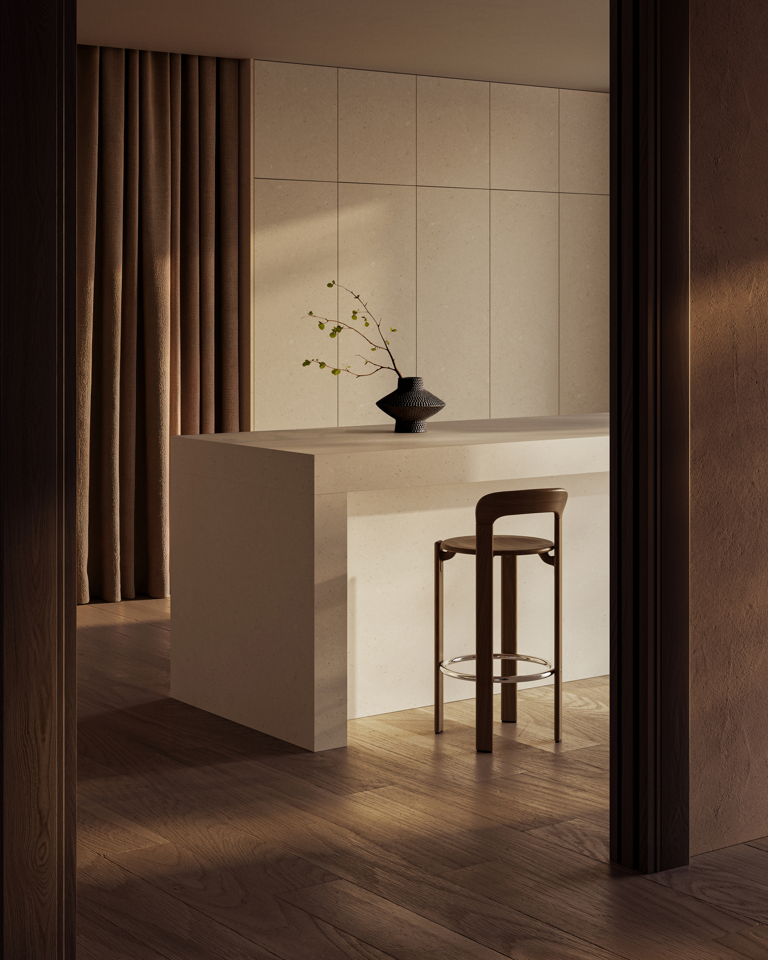
Balance, expressed through Dorset Mist: the solidity of architectural stone and the distinctive presence of its Petra finish.
 |
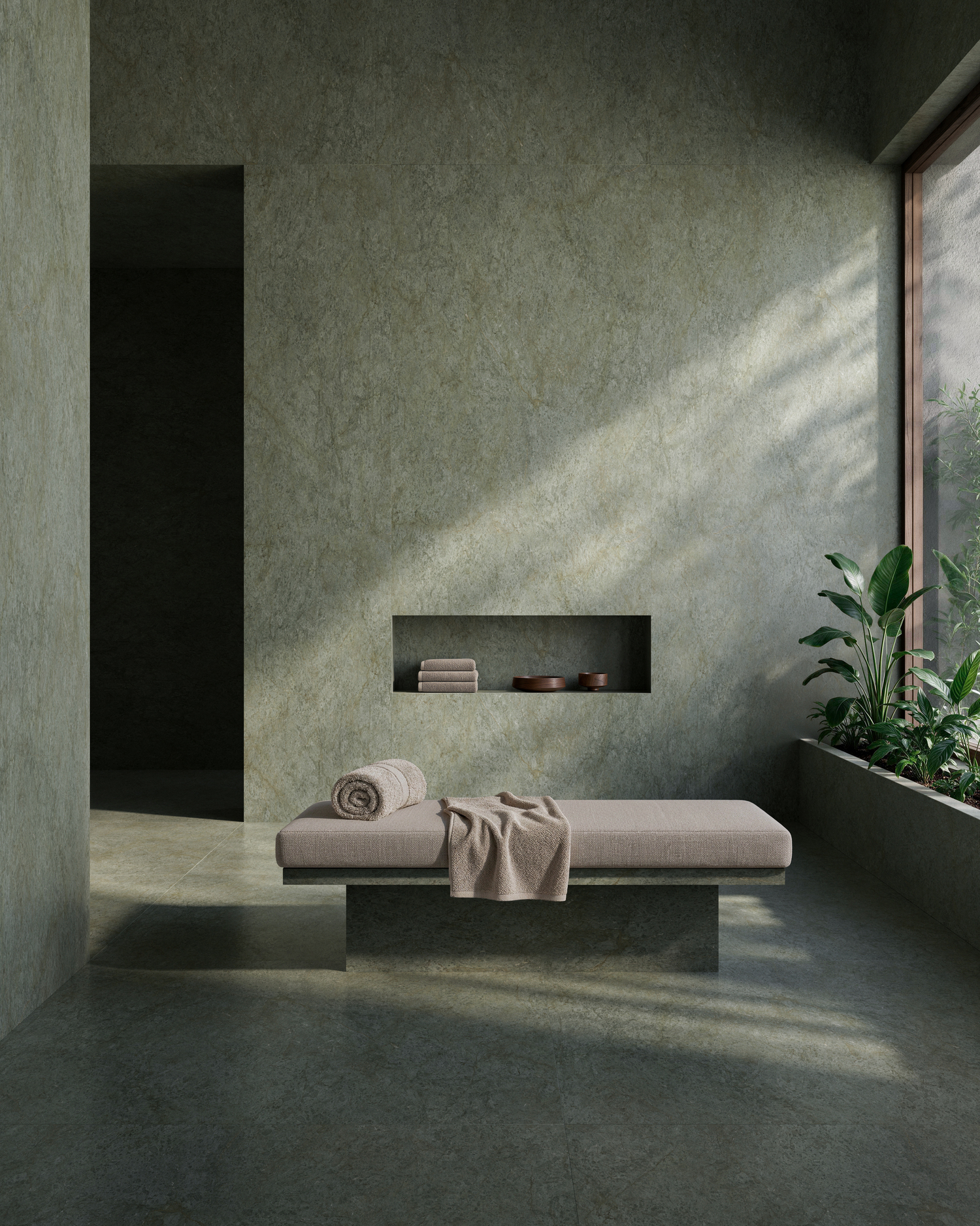 |
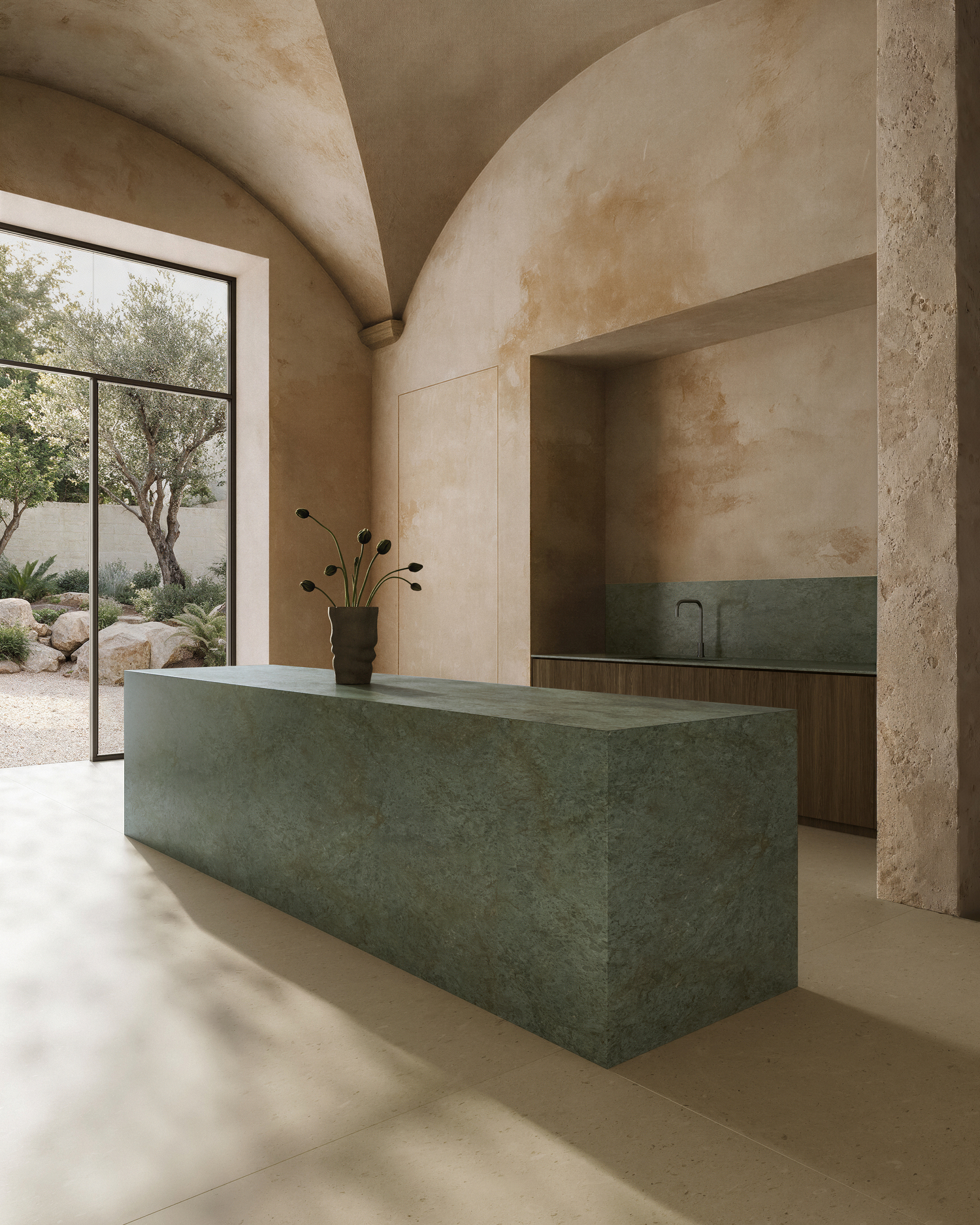
Renewal, expressed through Serene Emerald: the regenerative energy of nature, conveyed through green tones and an organic texture.
 |
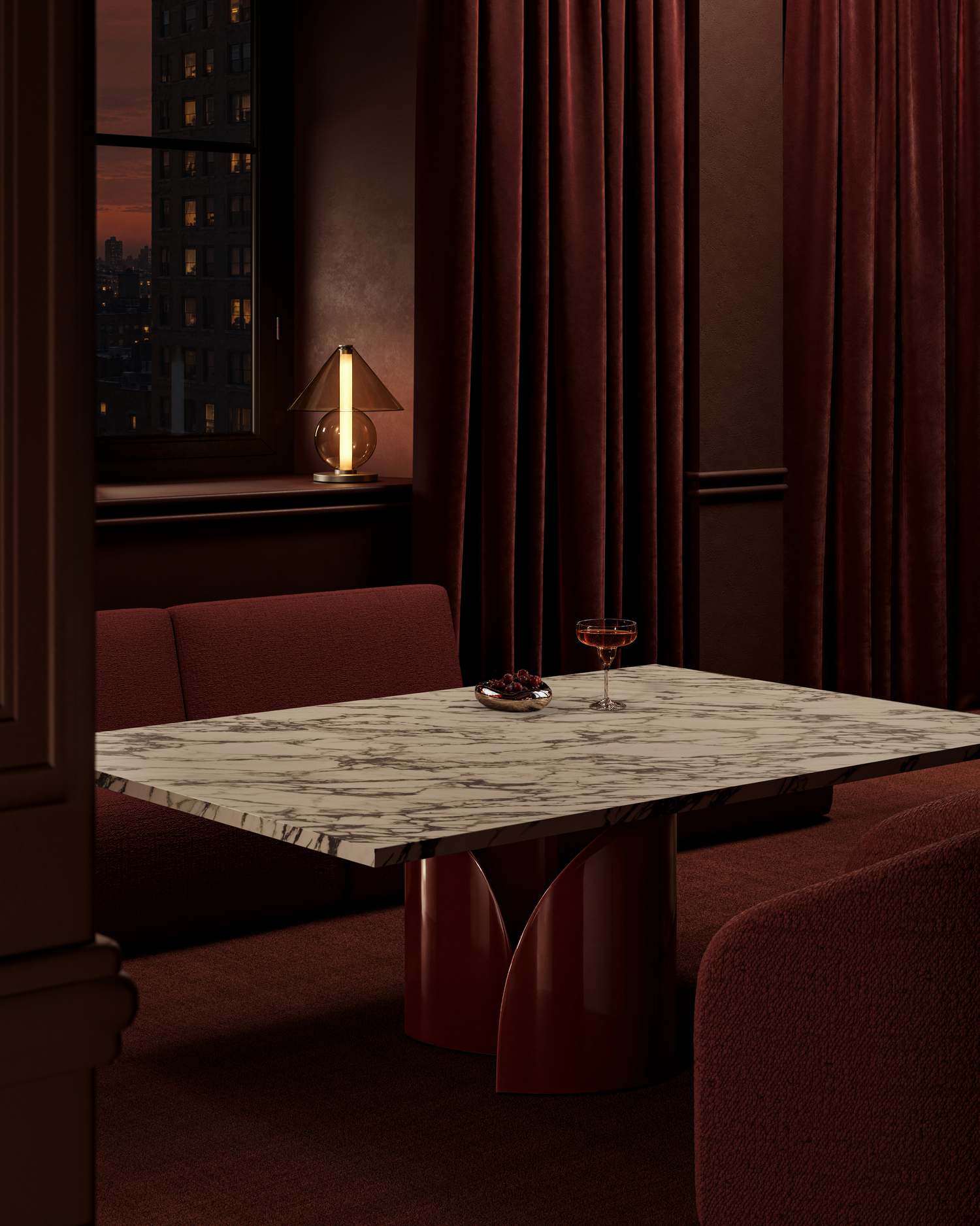 |
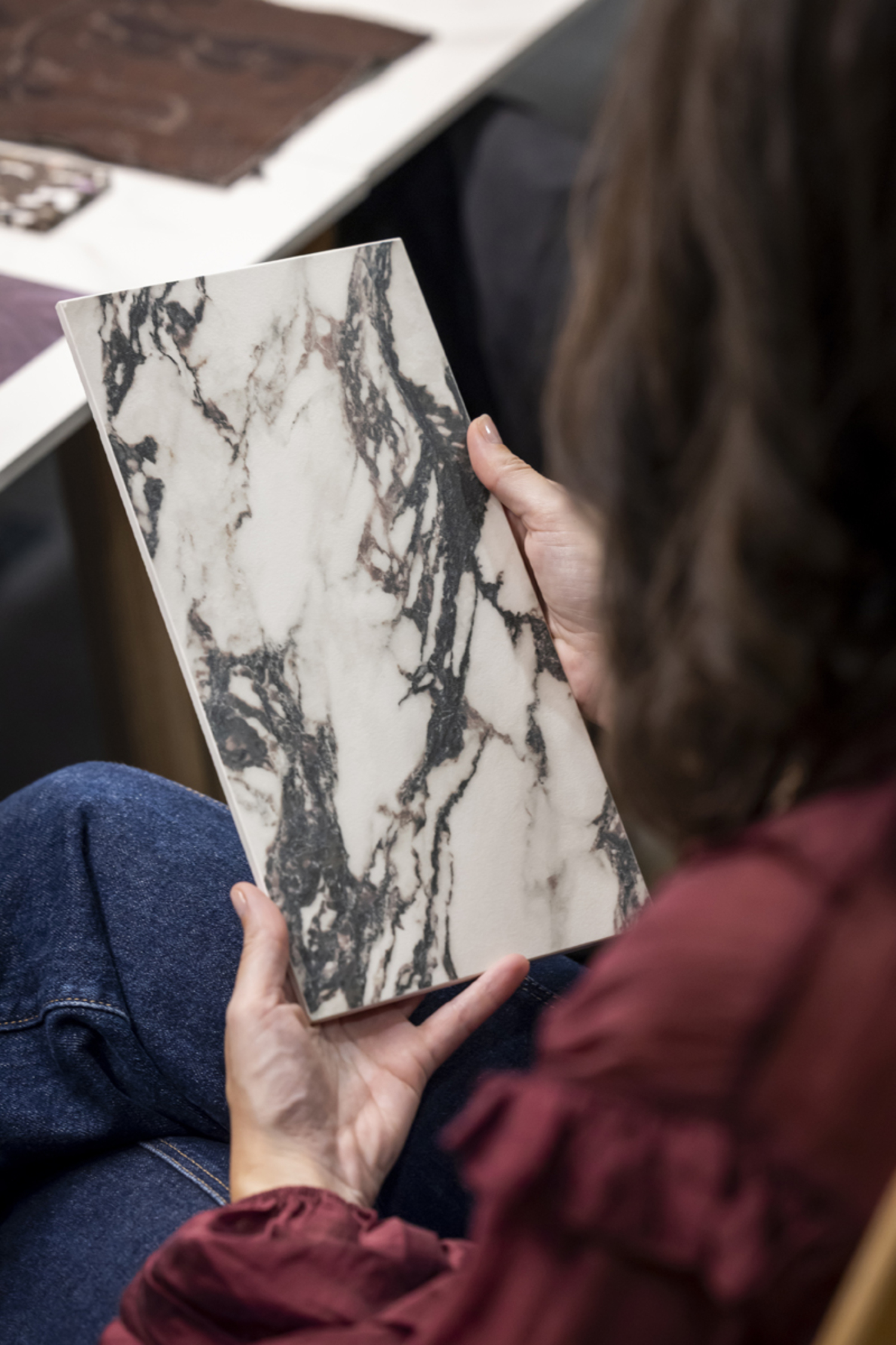
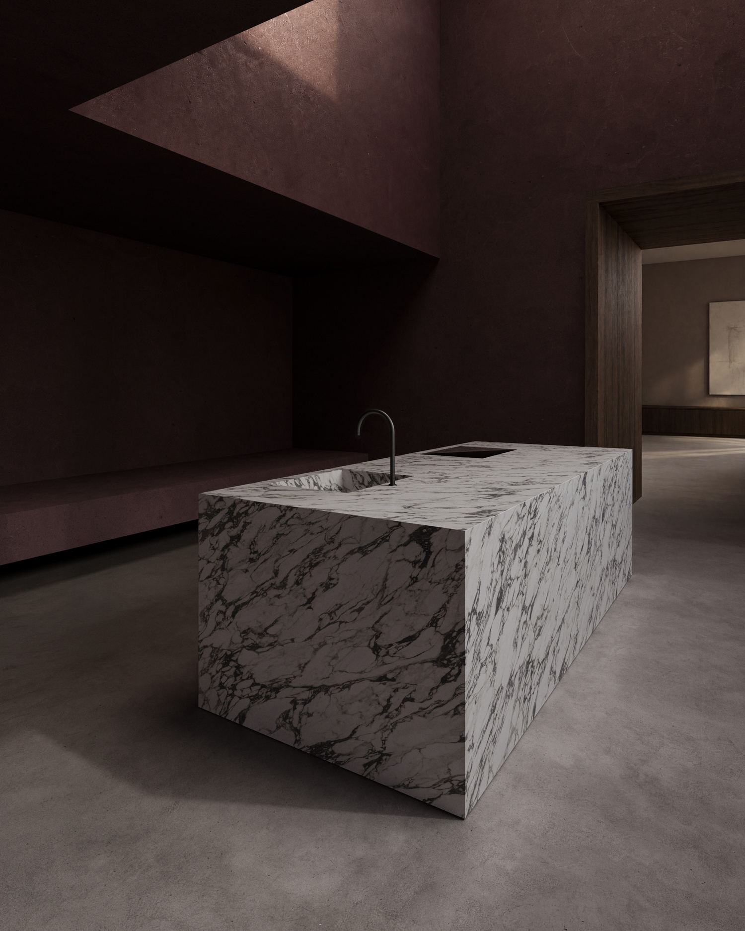
The strength of a distinctive identity, expressed through Calacatta Viola: the contrast of its burgundy and purple veining, inspired by the Italian tradition of expressive marble.
Within this creative universe, finishes also play an essential role. The soft matte quality of Honed evokes calm and intimacy, while Petra's texture creates a more immediate connection to nature.
“Material is not just something we look at. It is something we feel, experience, and remember.”
— Judith van Vliet, CMF Expert
Through this approach, THE EDIT. A new material language opens up new possibilities for architects and interior designers to make surfaces an active part of their creative vision, shaping spaces with personality through the emotions and sensations materials can convey.
Designing for emotion, today and in the future
How is our relationship with materials evolving? Judith points to a particularly significant shift: a growing interest in designs that carry meaning and continue to connect with people beyond passing trends.
In an increasingly digital and visually saturated world, physical experiences are becoming more valuable than ever. Textures, imperfections, and natural variations bring us closer to materials we can touch, feel, and continue to discover over time.
This perspective connects with a concept Judith refers to as emotional durability: the ability of certain materials to hold our interest and reveal new qualities as we live with them.
“The real challenge will be to create materials and spaces that continue to hold meaning, value, and emotional resonance over time.”
— Judith van Vliet, CMF Expert
Her words invite us to look at design from a different perspective. Because beyond its appearance, what makes a space special is also how it makes us feel, the memories it brings back, and the experiences it allows us to enjoy.
And that is precisely the conversation we want to continue exploring through THE EDIT. A new material language: an approach to materiality that expands creative possibilities and places emotions at the heart of design.